Painting Beautiful Autumn Colours
Do you know the feeling when you go for a walk and you see all these beautiful autumn colours and you want to paint them immediately? While you are walking you are thinking of what colours you have in your palette that might do the trick. A gorgeous autumn scene is already developing in your head and you can’t wait to put it down onto paper as soon as you get home. For several years I wanted to paint these stunning autumn colours, however, there was always something that got in the way as soon as I came home from my walk, e.g. a different project, the ironing, a phone call etc. My painting always had to wait and when I finally found time to do it, winter had started and the autumn leaves were gone… Not this year! I decided that if a time consuming painting doesn’t fit into my schedule, a quick colour analysis would and then it wouldn’t matter if I want to paint my autumn scene later in the year.
Watercolours vs. Oils

My first question is always, which medium will I use, watercolours or oils?
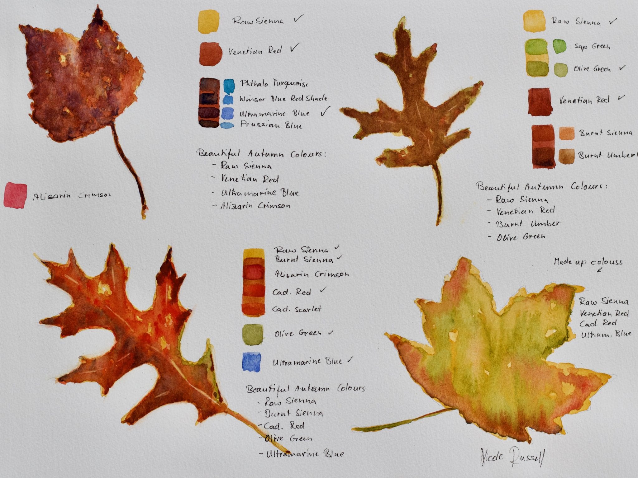
When you look at the different leaves, you can see that each of them shows colour variations within. Yellows flow into greens and reds, reds flow into browns and greens. Watercolours are a flowing medium and therefore perfect to show these subtle changes. Watercolours it is!
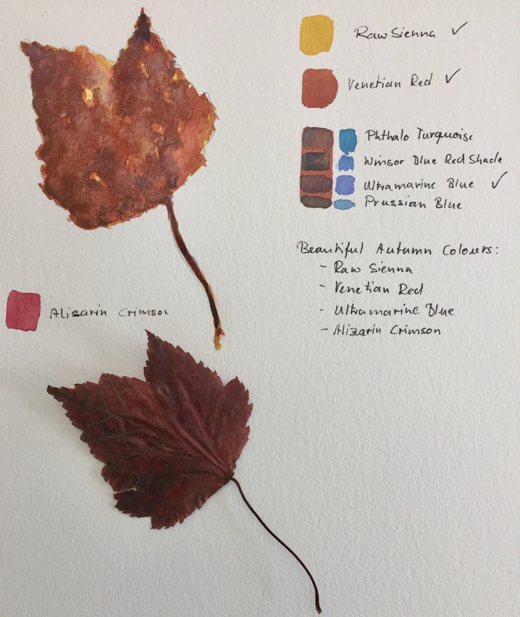
Colour Map
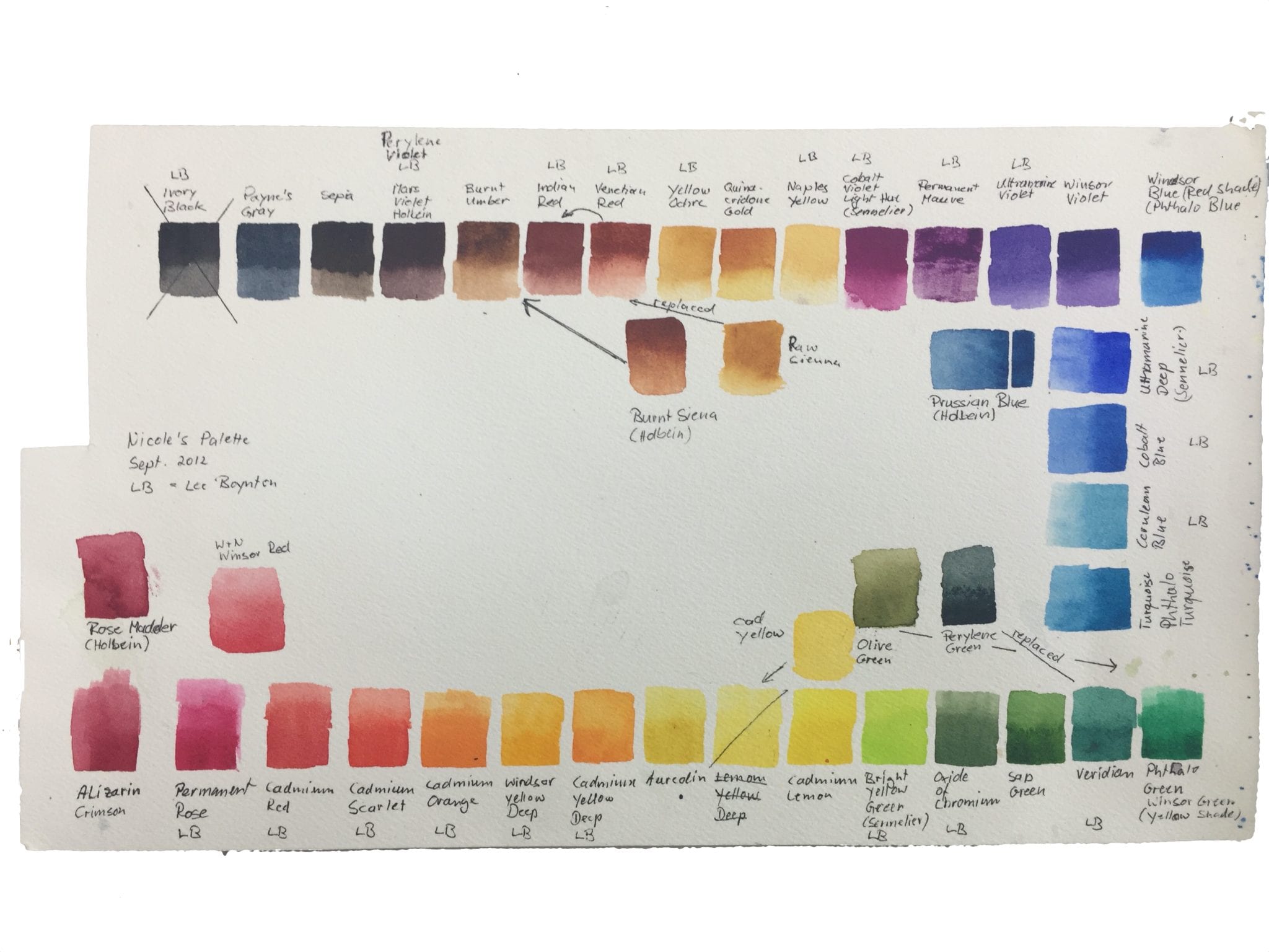
Do you have a colour map of your palette? If yes, then you know what a great tool it is to find exactly the right colour for your painting. A map shows you what your colour looks like on the paper, which paint tubes or the dry version in your palette don’t do well. Also it can show you different values of your colours and you can add some notes, e.g. transparent/opaque, staining/non-staining, etc. I love my colour map. It’s now 10 years old and I get it out every time I start a new painting. Here it is mapped against my palette:

Choosing Colours and Method

From my colour map I choose:
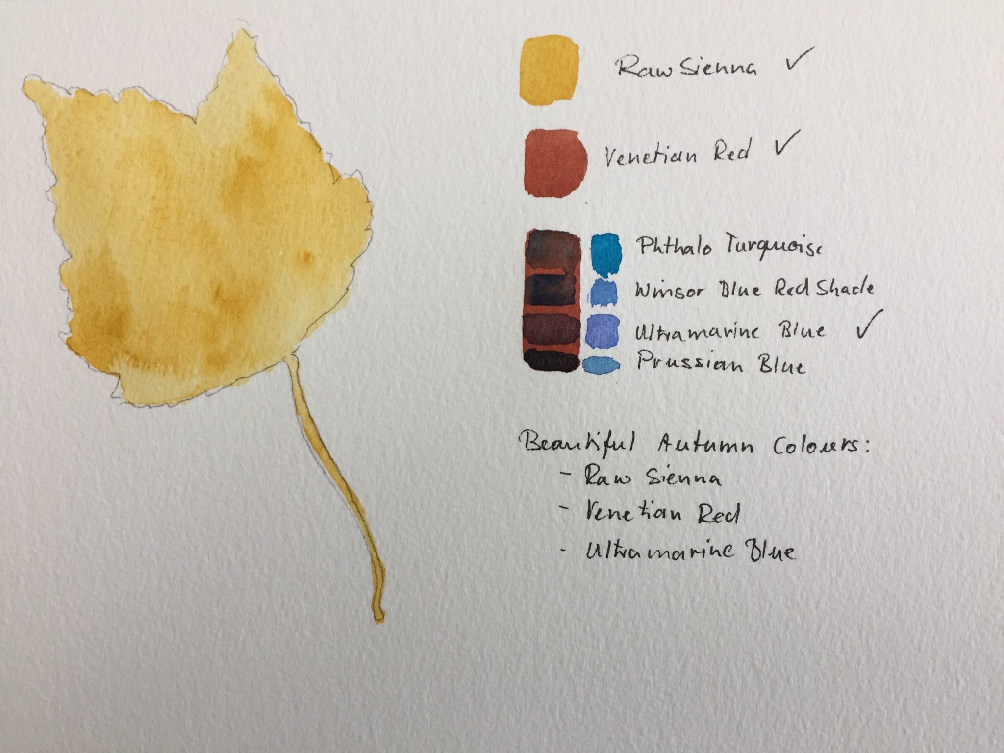
- Raw Sienna as the base colour (it seems to show in all the leaves)
- Burnt Sienna and burnt umber (a variation to the raw Sienna)
- Venetian red (it seems to show in all the reds)
- Cadmium red (a variation to the Venetian red)
- Alizarin crimson (a variation to the Venetian red and cadmium red)
- Ultramarine blue (a warm blue to darken some of the red areas)
- Olive Green
I also try out some different reds and greens in little colour swatches on the right side of the painting to see how they blend/layer, but decide to stay with the above list.
As a method I chose glazing, meaning I paint a layer of raw Sienna first, wait until it is dry and then paint the other colours on top. Glazing creates beautiful intense colours since each layer shines through and adds pigment to the next layer.
A word of caution though: Raw Sienna is an Earth colour, which means that it is non-staining, which again means that it lifts off easily when you put a second layer of a different colour over it. You can avoid this by using a soft sable brush rather than a synthetic brush. Or a different method, wet-on-wet, which I used in my final autumn painting “Autumn in the City”. This painting I is discussed in my next blog.
My final exercise painting will always stay with me and I know it will come in handy whenever I paint another painting using autumn colours.
Paper: The Langton, 12” x 16”, 140lb cold pressed.
Contact me if you have any questions. Until then – HAPPY PAINTING!
Nicole Russell